Logo Design
Chandu Mama's Cafe
Designer's Brief
Company Name : Chandu Mama's Cafe (A Tea-Coffee Chain)
About the chain :
Located in Bangalore
Started a single joint in 2014, now expanding to 17 joints across major areas in the city by end of 2015
Serve tea, coffee, other beverages and snacks
About the logo requirement :
Branding Building - Clearly identifiable as a hang out place for family and friends
To go on all media – paper napkins, carry bags, placemats, disposable containers, digital media, banners, stationery,
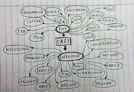
Ideation
Designs

Design 1 :
Logo includes the main aspects of a coffee shop -
1. coffee (mugs/cups)
2. people
3. conversation
The logo is down in a shade of brown to grab the essence of rich aromatic coffee beans or freshly brewed ginger tea
Design 2 :
Logo is designed to look like a tea "pyali" glass
This type of glass has been associated with tea for ages in India. The logo is sure to inform the viewer that the brand is a tea/coffee shop.
The logo, designed in brown, is designed out of the letters C and M which stand for Chandu Mama. This typographic design incorporates a simplistic and a minimalistic attitude which is sure to strike a chord with the viewer.
