Semiotics
Escalator Sign Re-Design
Defined as the study of use of signs and icons, semiotics is the essence of the following project.
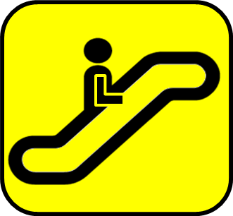
Escalators are now an everyday affair at malls, airports, railway & metro stations etc. Often, the escalator to go upward and downward are placed separately. The sign displayed indicates the presence or location of the escalator – not the direction in which it will take you. Like the images on the below.

By looking at the sign, one cannot find out if the escalator will go upwards or downwards. Getting to the correct escalator is a matter or sheer luck then. Some designers went a step further and made designs like the image on the right above.

To me it appears quite complicated and confuses the eye. Though the direction of movement is clear, it triggers a thought that there is a scope for improvement. Hence, the design below. The hand indicates the direction in which the person is facing. From a distance, the hand direction may or may not be very clear. The addition of an arrow completes the sign.